Clarity for a professional audience
JFC Plus works in people development and professional training. The website introduces the organisation and helps visitors move between corporate training, government-related programmes and publication information. For an audience comparing learning providers, structure and legibility matter as much as decoration: the site needs to explain what the organisation does before asking for a conversation.
An information-first homepage
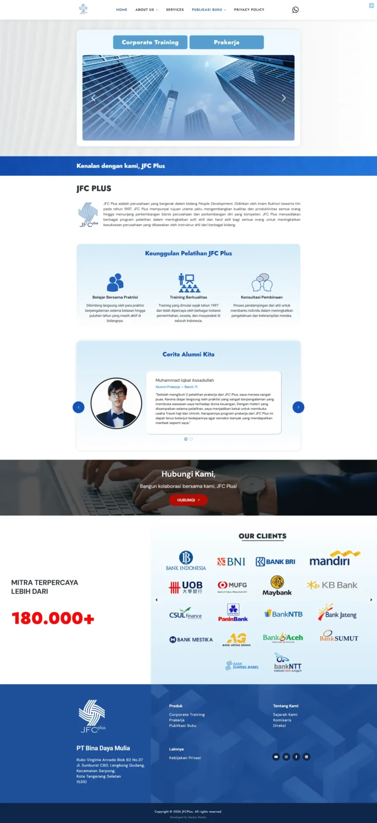
The supplied capture shows a light visual system, blue section accents and a prominent introductory hero. Navigation exposes company background, training services and published materials. Below the opening area, content introduces the provider, outlines training strengths and makes institutional information available to prospective clients. This gives a decision-maker a useful path from orientation to a closer look at services.
Designed for scanning
Short headings, separated content bands and clear visual groupings help users locate relevant material quickly. The site balances corporate familiarity with practical access to programmes, instructors and organisational background. Rather than overloading the first screen, the structure allows visitors to decide how much detail they need.
What can be substantiated
The public website describes JFC Plus as a people-development company and identifies professional training as a core activity. The captured homepage supports the description of the information architecture and visual presentation. No campaign figures, visitor growth or implementation date were provided, so those claims are deliberately excluded.